Party health bars for healers
Threat levels for tanks
Procs and/or DoT Durations for DPS
If you're raiding, this would likely also include
Boss Health, timing of bad stuff, warnings about where you're standing, that sort of thing
If you're PVPing, this would likely also include stun durations, cooldowns of your team, that sort of thing.
Now figure out how you want to display this most important stuff. Party health bars could be displayed by Grid or vuhdo or the raid frames addon of your choice. Threat levels can be displayed by Omen or tidy plates: threat plates. Procs could be displayed by NeedtoKnow, Power Auras, or a bunch of others. Dot durations can also be displayed by the above.
Positioning wise, the most important thing to remember is....
PUT THE MOST IMPORTANT STUFF CLOSE TO YOUR TOON!
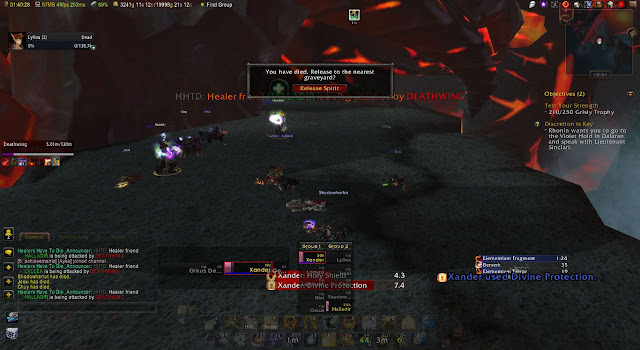
Now, here's Lyllea's healing UI in a raid, to see what I'm talking about....
Notice vuhdo right in the center there? And under it is BigWigs countdowns for tank cooldowns. Below Vuhdo are my bars, and my cooldowns are shown on the spells themselves.
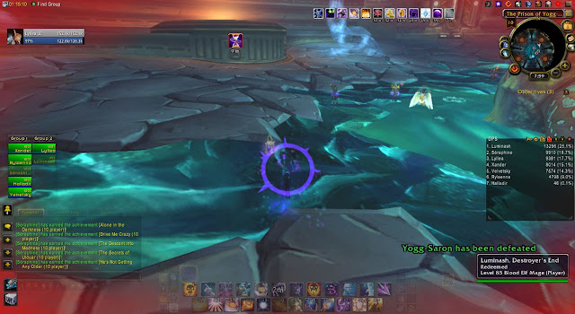
And here we see her DPS UI. See the difference (other than the minimap, which is due to it being patch day when this was taken and out-of-date addons weren't enabled)? Power auras is telling me I have shadow orbs, and vuhdo's off to the side.
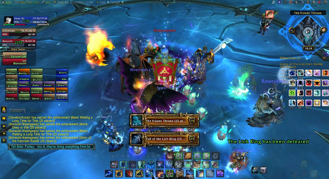
And here's Eiunn's DPS UI as another example. Hopefully this gives you some ideas.


No comments:
Post a Comment